GSAP Image Hover Effect: Tiles Bloom from the Cursor
Overview
An image hover effect for React and Next.js. A second photo opens out as a grid of dots that grow into square tiles, starting from wherever the cursor came in, and it closes back up towards wherever the cursor leaves.
Each tile's delay comes from its distance to the point where the cursor crossed the edge, so entering from a corner and entering from the middle of a side look different. Dots grow out of that point and square up as they meet, and moving away mid-way simply reverses from wherever each tile has got to.
(01)Keep exploring
All 118 componentsBuilt with the same techniques
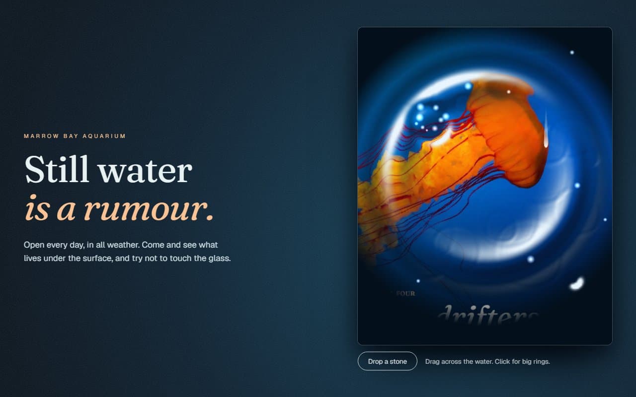
No. 111 / Cards
Water Ripple Image Hover Effect with Canvas
On Load · On Hover · Mouse Move · On Click

No. 011 / Gallery
GSAP Infinite Tile Frame Portfolio Archive
On Scroll · Drag · Mouse Move · On Hover · On Load

No. 117 / Cards
Tear Strip Envelope Reveal with a Draggable Tab, on Canvas
On Load · Drag · On Click
(02)FAQ
GSAP Image Hover Effect: Tiles Bloom from the Cursor — FAQ
01How do I set the size?
Through className, with an aspect ratio or a height, such as aspect-[4/5]. Both images are cropped to fit.
02Can I change the grid?
Pass columns and rows. Larger tiles look blockier and bolder. The default 8 by 10 suits a portrait card, and every tile is one more element to animate, so avoid going far beyond a hundred.
03Can I put a title over the image?
Yes. Anything passed as children sits above both photos.
04Why isn't the hover image optimised?
Each tile uses it as a CSS background, so next/image can't resize it. Export it close to the size it displays at, which keeps it light.
05What happens with reduced motion?
The two photos crossfade quickly, with no tiles moving.