GSAP 3D Tilt Card Hover Effect
Overview
A 3D tilt card for React and Next.js: it leans toward the cursor, its layers separate by depth, and a soft light follows the pointer across the face and around the edge.
Wrap any card content and add data-depth to the parts you want to separate. Positive numbers float above the card and negative ones sink behind it. Layers move in 2D, so rounded corners and overflow-hidden keep working, which true 3D layers would break.
Details
- Category
- Cards
- Interaction
- Mouse Move + On Hover
- Trigger
- Mouse Move
- Languages
- React, TypeScript, Tailwind
(01)Keep exploring
All 118 componentsBuilt with the same techniques
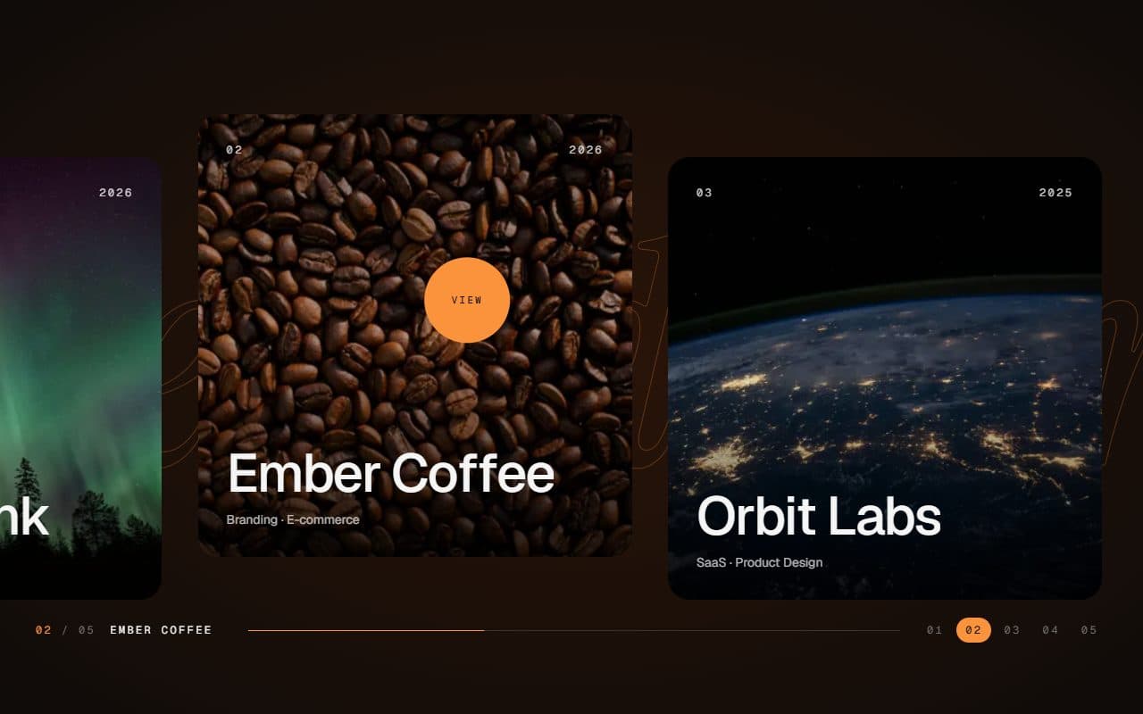
No. 028 / Gallery
GSAP Horizontal Scroll Gallery with Lenis and Fullscreen Project View
On Scroll · Mouse Move · On Hover · On Click
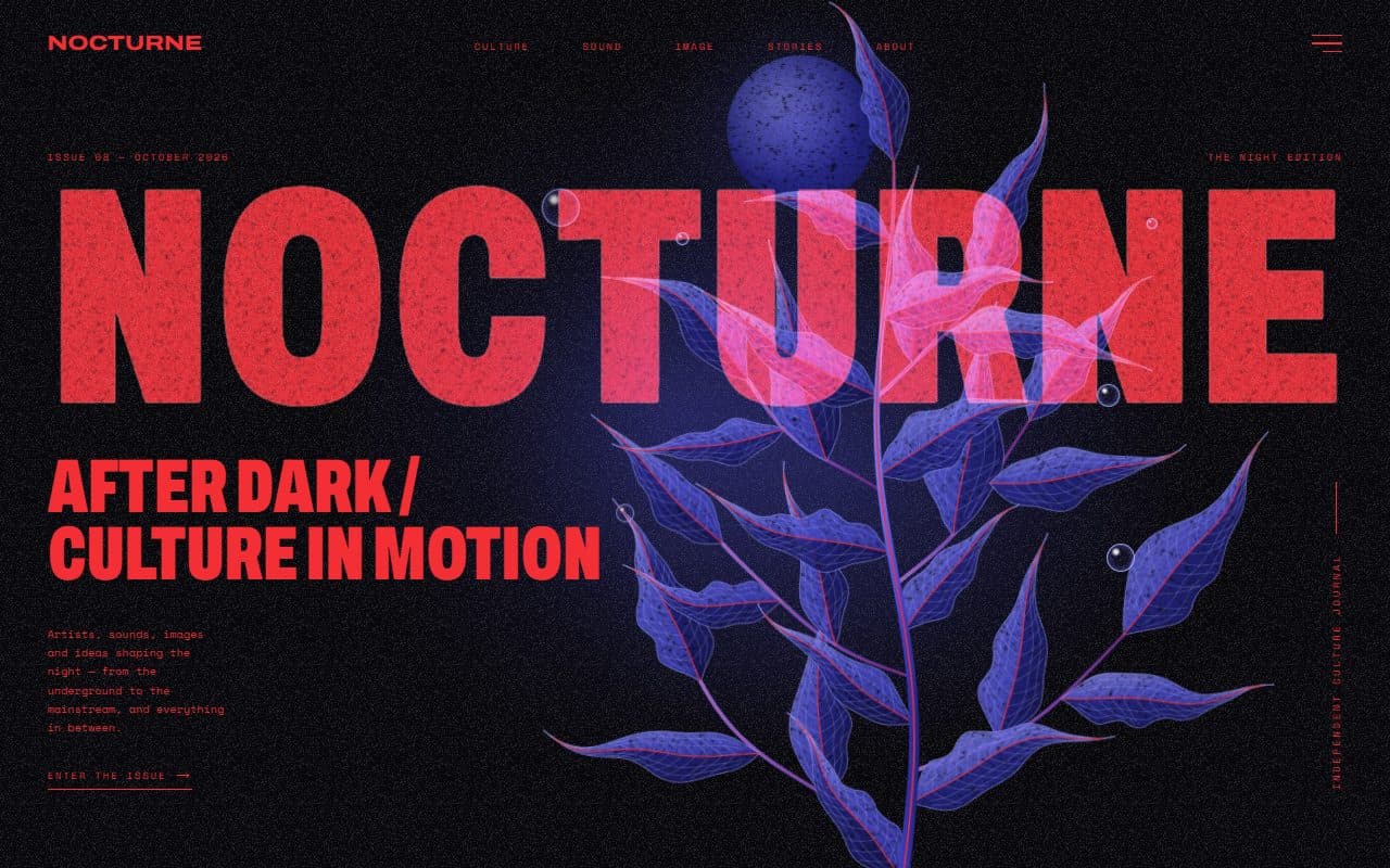
No. 022 / Hero
GSAP Editorial Night Hero with Growing Botanical SVG
On Load · Mouse Move · On Hover · On Click
No. 001 / Buttons
GSAP Magnetic Button Hover Effect
Mouse Move · On Hover
(02)FAQ
GSAP 3D Tilt Card Hover Effect — FAQ
01How do I add depth to my own content?
Put data-depth on any element inside the card, like data-depth="1.5" on a title. The depth prop sets how many pixels a layer with data-depth="1" moves at full tilt.
02Why does the demo image have a scale class?
A background layer that drifts needs a little spare image around its edges. Scale it to about 110% and the gaps never show.
03Does it work on mobile?
Touch screens have no cursor to follow, so it renders as a regular card with your content in place.