GSAP Image Hotspots Section with Animated Leader Lines
Overview
An interactive image hotspots section for React and Next.js. Hover, tap or tab to a pulsing point, and a reticle glides across the photo while an SVG leader line draws out to a callout card.
Choosing a point runs in order: the old line pulls back, the crosshair glides to the new point with its coordinates counting along, the callout card slides level with it, and the leader line draws out from the point to the card. Change your mind halfway and it carries on from wherever it is, with no jumps.
Details
- Category
- Features
- Interaction
- On Hover + On Click + On Scroll
- Trigger
- On Hover
- Languages
- React, TypeScript, Tailwind
(01)Keep exploring
All 118 componentsBuilt with the same techniques

No. 092 / Comparison
GSAP Comparison Table Section: Us vs Them with Flip
On Scroll · On Click
No. 059 / Integrations
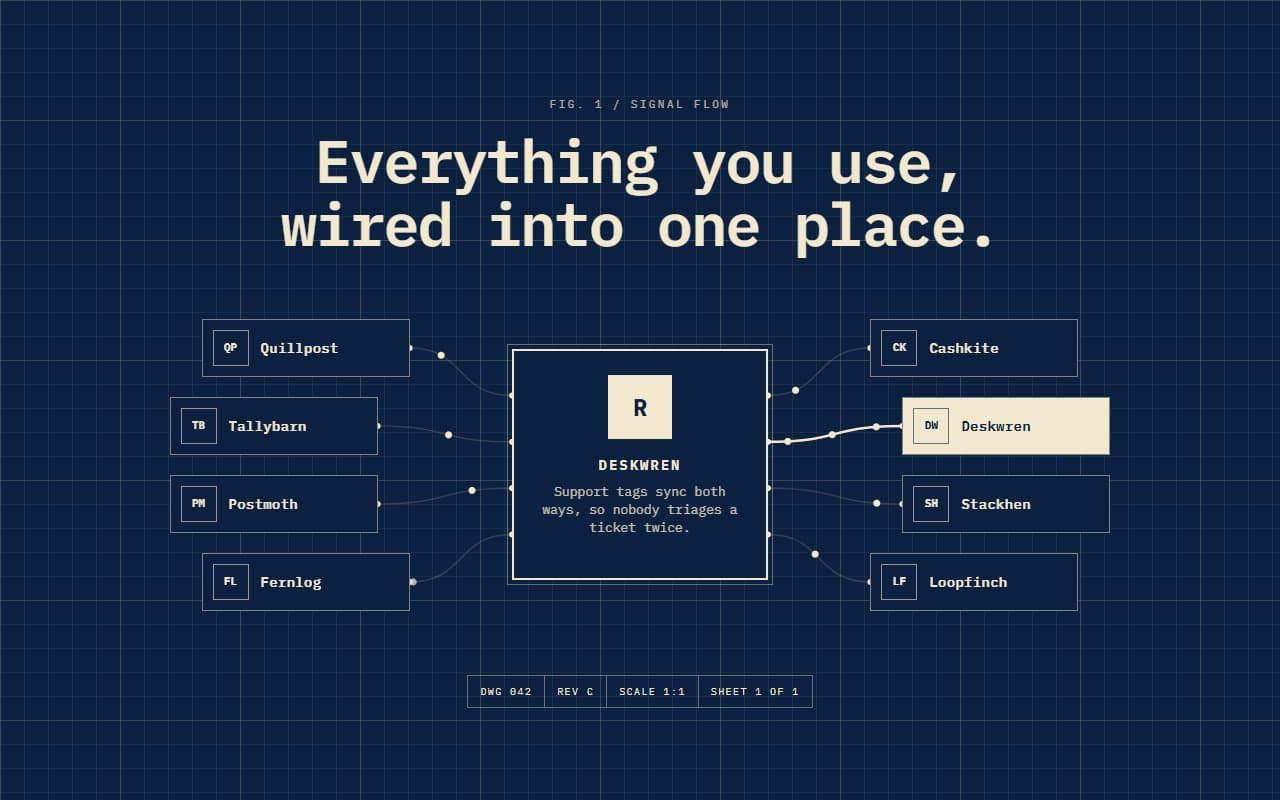
GSAP Integrations Section with Animated SVG Wires
On Hover · On Scroll
No. 086 / Features
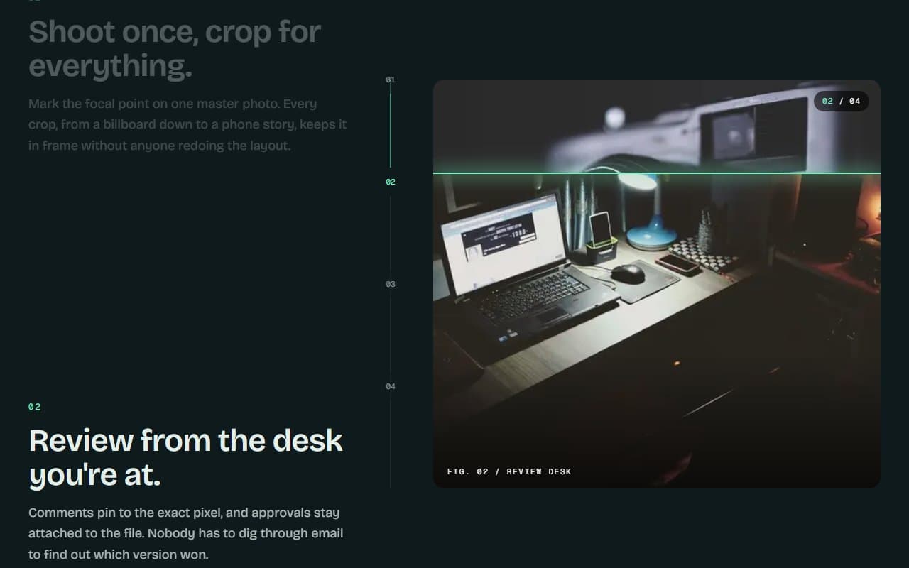
GSAP Sticky Scroll Features Section with Image Wipes
On Scroll · On Click
(02)FAQ
GSAP Image Hotspots Section with Animated Leader Lines — FAQ
01How do I place the hotspots?
Give each one an x and y from 0 to 100, measured across your image. Also pass the image's real width and height. The frame keeps that shape instead of cropping, so the points stay on their targets at every screen size.
02Does it have to be a photo?
It takes anything next/image can show, so a product shot, a floor plan or an annotated diagram all work.
03Can I change the look?
Yes, with the accent, background and color props. It uses your page's font, and the demo loads JetBrains Mono for the instrument feel.
04What does it need from my page?
npm install gsap @gsap/react, Tailwind CSS v4 and next/image. It has no other dependencies.
05What happens with reduced motion?
The crosshair, card and line go straight to the new point, and the hotspots stop pulsing. Everything stays usable by mouse, touch and keyboard.