GSAP Sticky Scroll Features Section with Image Wipes
Overview
A sticky scroll features section for React and Next.js. Text steps scroll on the left while a pinned frame on the right wipes to the next image, in the direction you're scrolling, beside a numbered progress rail.
Scroll down and the next image rises over the current one behind a thin line of light. Scroll up and it comes down from the top instead. Turn around halfway through a wipe and it runs back the way it came, and scrolling fast stacks the wipes on top of each other, so the frame never shows a gap.
Details
- Category
- Features
- Interaction
- On Scroll + On Click
- Trigger
- On Scroll
- Languages
- React, TypeScript, Tailwind
(01)Keep exploring
All 118 componentsBuilt with the same techniques

No. 087 / Team
GSAP Team Section with Names That Reveal Portraits
On Hover · On Click · On Scroll

No. 048 / CTA
GSAP Call to Action Section with Hover Colour Flood
On Hover · On Click · On Scroll
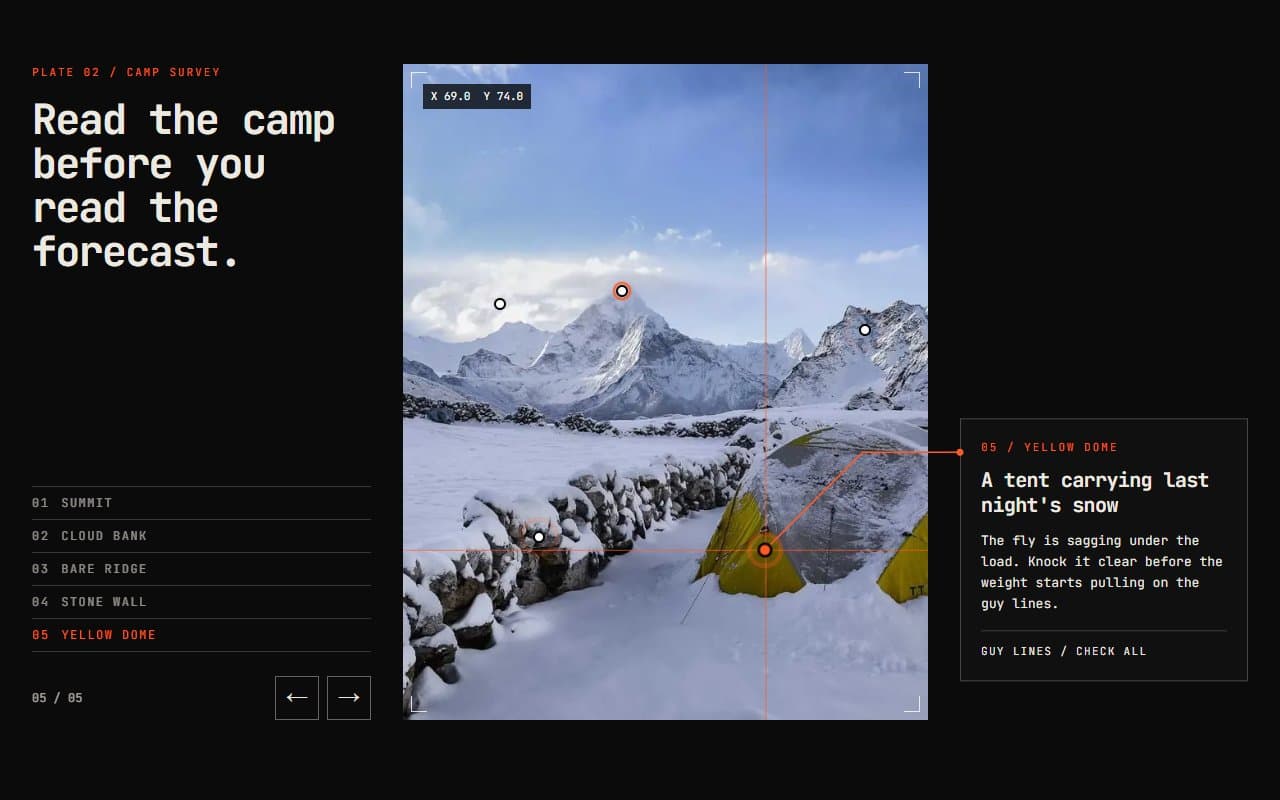
No. 058 / Features
GSAP Image Hotspots Section with Animated Leader Lines
On Hover · On Click · On Scroll
(02)FAQ
GSAP Sticky Scroll Features Section with Image Wipes — FAQ
01What goes in each step?
Pass features with a title, body, image and alt. An optional caption sets the short line inside the frame, and defaults to the title.
02Do the steps have to be the same height?
No. Each step is at least 72% of the screen tall and grows with its text. The switch points and the rail's numbers are measured from the real steps.
03Can I change the colours?
Yes, with the background, color and accent props. Headings use your page's font; the demo loads Bricolage Grotesque.
04What does it need from my page?
npm install gsap @gsap/react, Tailwind CSS v4 and next/image. Don't put it inside a parent with overflow hidden, because that stops position: sticky from working.
05What happens with reduced motion?
Images swap instantly with no wipe, and phone images appear without a reveal. The rail still tracks your scroll position, since it moves only as you scroll.