GSAP Split-Flap Client Logo Wall Section
Overview
A client logo section for React and Next.js built like a station departure board: tiles unfold from their hinges as you scroll in, then flip one at a time to the next logo, with a little bounce as each flap lands.
Each logo is drawn twice and clipped into a top and bottom half. On a flip, the old top half falls forward on the centre hinge, then the new bottom half lands over the old one and bounces. Only one tile moves at a time, so a long list of clients fits into a small grid without feeling busy.
Details
- Category
- Logos
- Interaction
- On Scroll + On Load + On Hover
- Trigger
- On Scroll
- Languages
- React, TypeScript, Tailwind
(01)Keep exploring
All 118 componentsBuilt with the same techniques
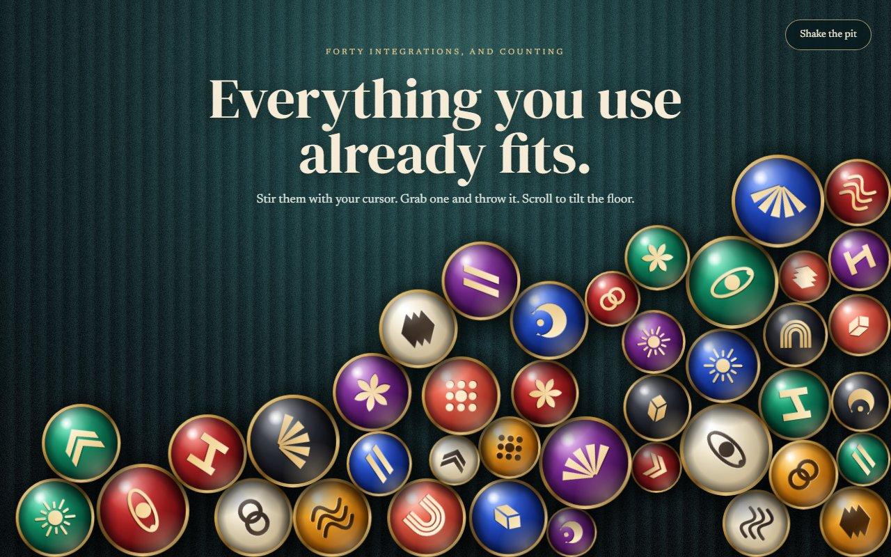
No. 106 / Logos
Logo Ball Pit Physics Section with Canvas
On Load · Mouse Move · Drag · On Scroll
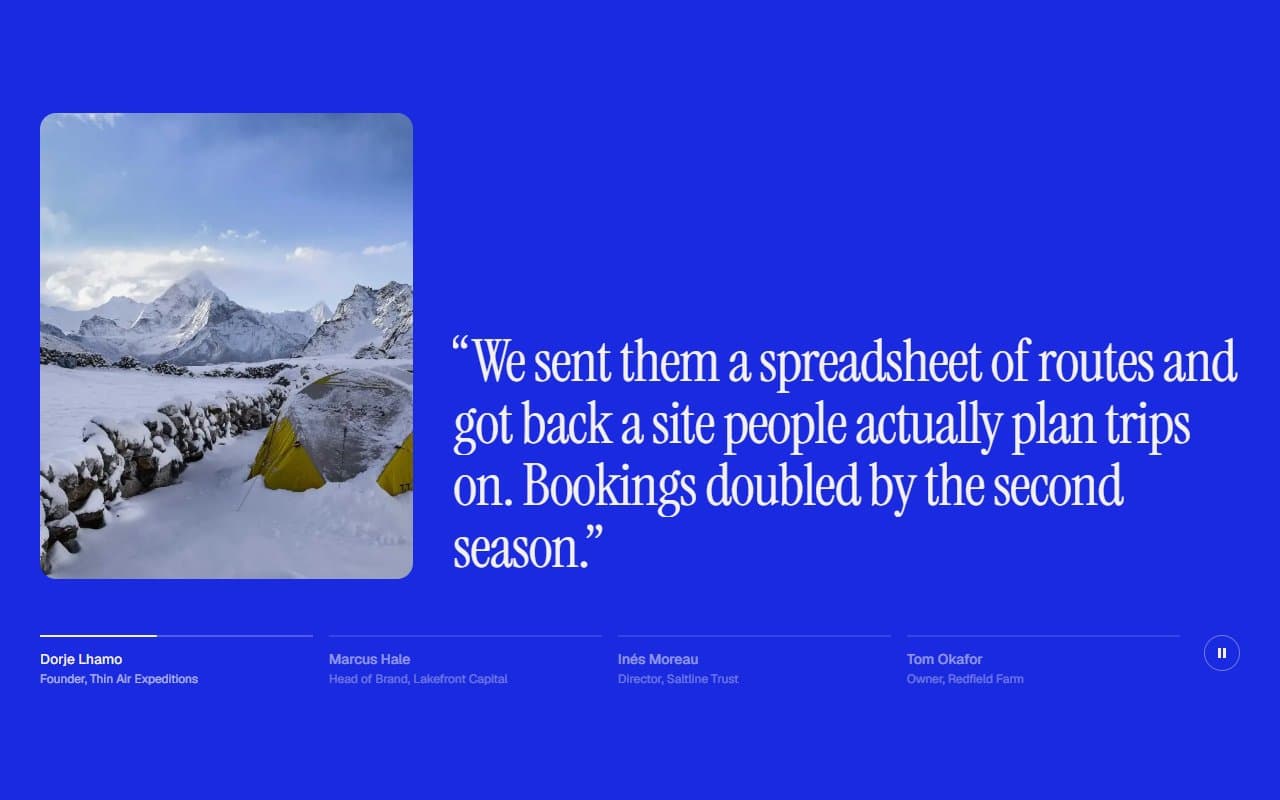
No. 088 / Testimonials
GSAP Testimonials Section with Auto-Advancing Quotes
On Load · On Click · On Hover · On Scroll
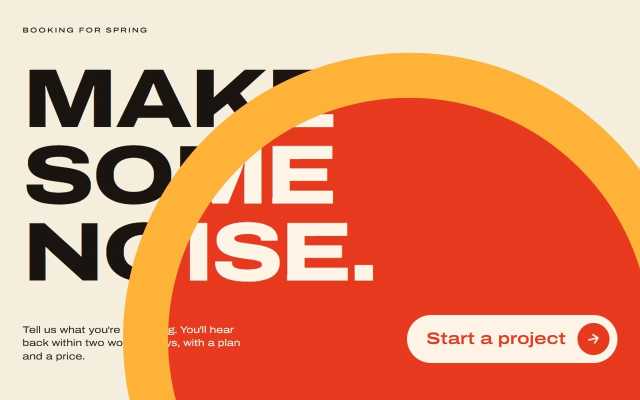
No. 048 / CTA
GSAP Call to Action Section with Hover Colour Flood
On Hover · On Click · On Scroll
(02)FAQ
GSAP Split-Flap Client Logo Wall Section — FAQ
01How many logos do I need?
Twice as many as tiles works best. Logos are dealt out to tiles in order, and a tile with a single logo stays still. The default is 8 tiles, so give it 16 logos.
02Can I use SVG logos?
Yes. Pass any SVG or styled element as mark. Use currentColor for fills and the logos pick up the section's text colour.
03Can I change the grid?
Set tiles for the number of tiles and gridClassName for the columns, for example grid-cols-3 lg:grid-cols-6.
04What happens with reduced motion?
The first eight logos sit still with no unfolding or flipping. The screen-reader list still names every client.