GSAP Custom Cursor with Snapping Corner Brackets
Overview
A custom cursor for React and Next.js: four corner brackets turn slowly around the pointer, then whip square and lock onto any link or button you hover, with an optional label above the target.
Drop it in once and every link and button on the page becomes a target. The brackets find the element's exact box, follow it while it scrolls or moves, and let go if it disappears. Each corner trails slightly behind the last, so the shape stretches a little as it travels. A press squeezes it in, then it springs back.
Details
- Category
- Cursor
- Interaction
- Mouse Move + On Hover + On Click
- Trigger
- Mouse Move
- Languages
- React, TypeScript, Tailwind
(01)Keep exploring
All 118 componentsBuilt with the same techniques
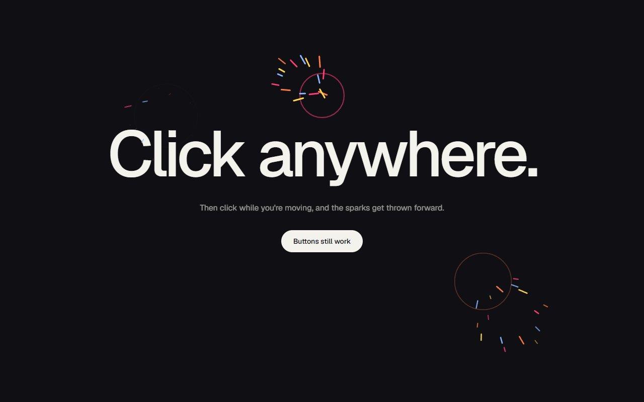
No. 037 / Cursor
GSAP Click Spark Animation for React
On Click
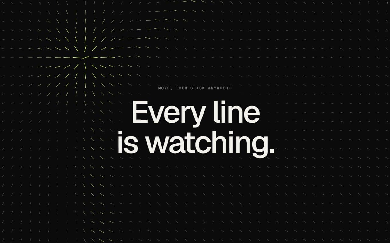
No. 068 / Backgrounds
GSAP Interactive Canvas Background: Needle Field
Mouse Move · On Click · On Load
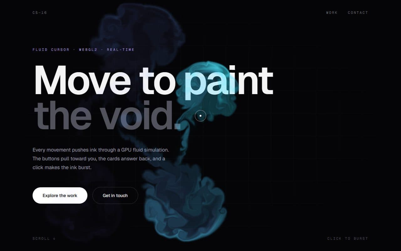
No. 025 / Cursor
WebGL Fluid Cursor Trail with Magnetic Morphing Cursor
Mouse Move · On Hover · On Click
(02)FAQ
GSAP Custom Cursor with Snapping Corner Brackets — FAQ
01How do I choose what it locks onto?
It targets a, button and [data-snap] by default. Pass your own CSS selector through selector to change that.
02Does it affect touch screens or keyboard users?
No. It only starts on devices with a mouse-style pointer, and the system cursor is only hidden after the first real mouse movement. Touch and keyboard use stay exactly as they were.
03Can I keep the normal cursor visible as well?
Yes. Pass hideSystemCursor={false}, and the brackets become an extra layer around it.
04Where should I put it?
Once, in your root layout. It's a fixed overlay that ignores pointer events, so it never gets in the way of clicks.
05What happens with reduced motion?
The brackets don't spin when idle. They still follow the pointer and lock onto targets, because the visitor is the one moving them.