GSAP Call to Action Section with Hover Colour Flood
Overview
A call to action section for React and Next.js where hovering the button floods the whole section with colour from the exact point the cursor came in. The type inverts along the moving edge, and the flood drains to wherever the cursor leaves.
The whole section reacts to one button. The flood opens as a circle from the point the cursor crossed the button's edge, with a thin amber band leading it, and it drains back to the point where the cursor leaves. Come in from the left and it starts on the left. Leave part way and it slides over to your new position instead of restarting.
Details
- Category
- CTA
- Interaction
- On Hover + On Click + On Scroll
- Trigger
- On Hover
- Languages
- React, TypeScript, Tailwind
(01)Keep exploring
All 118 componentsBuilt with the same techniques
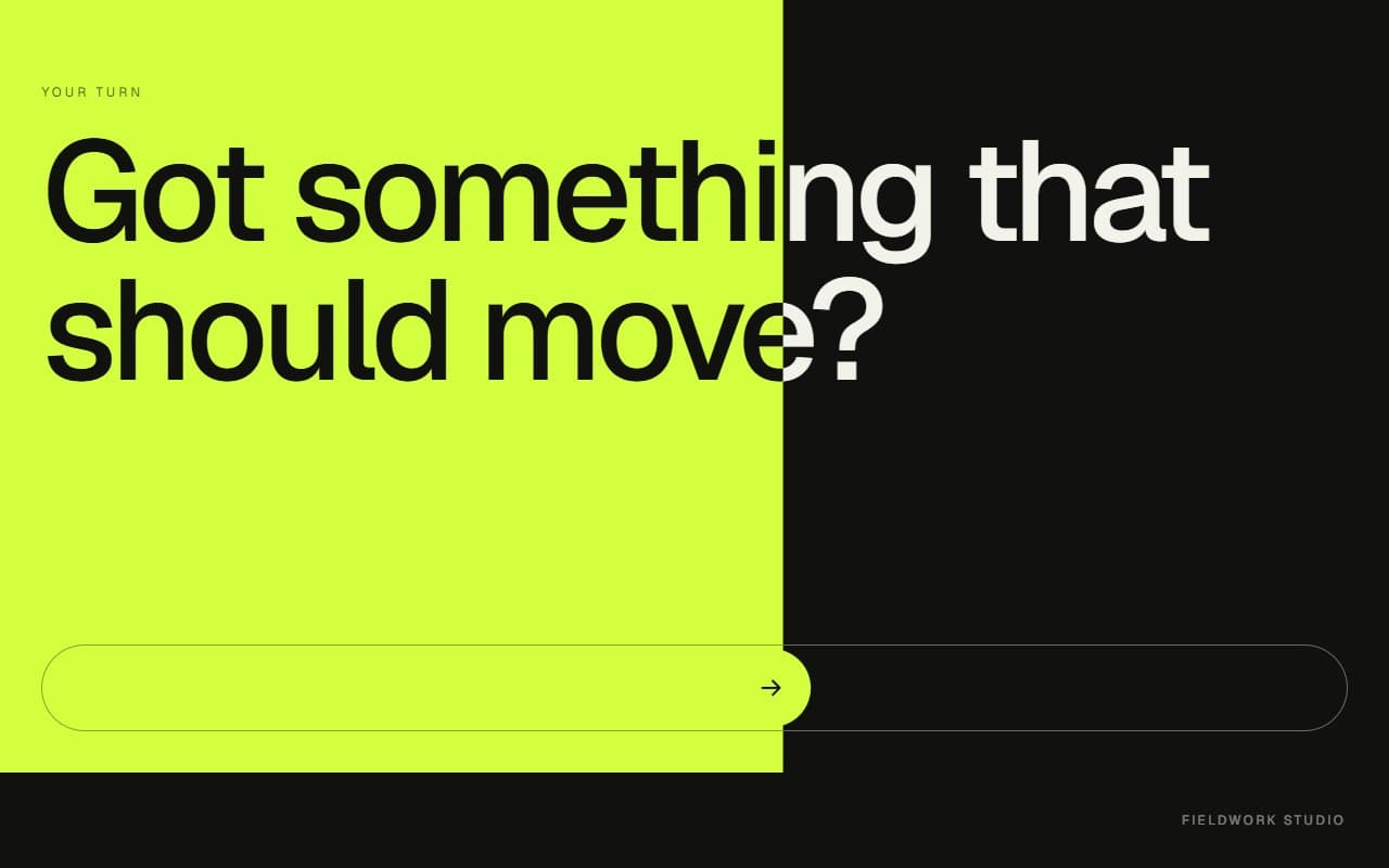
No. 083 / CTA
GSAP Slide to Confirm Call to Action Section
Drag · On Click · On Scroll
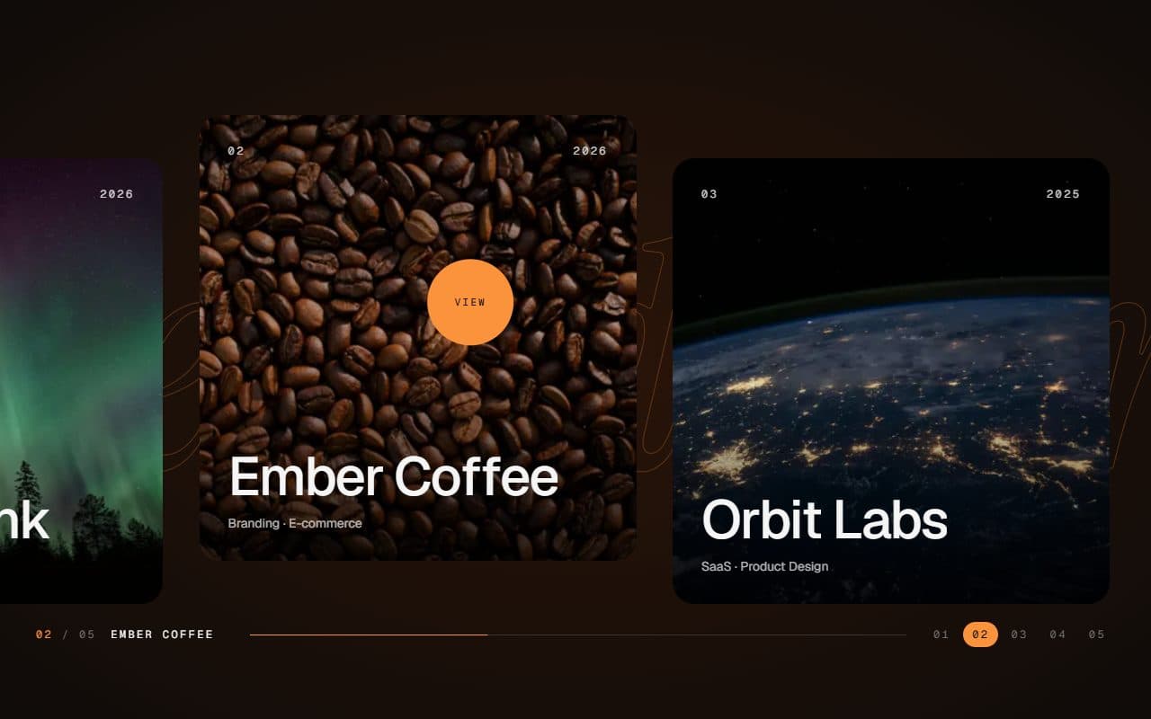
No. 028 / Gallery
GSAP Horizontal Scroll Gallery with Lenis and Fullscreen Project View
On Scroll · Mouse Move · On Hover · On Click
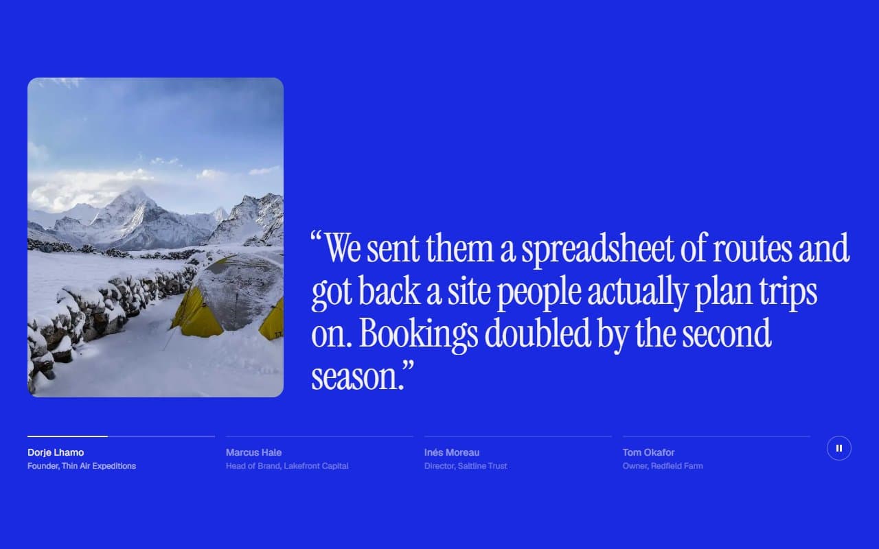
No. 088 / Testimonials
GSAP Testimonials Section with Auto-Advancing Quotes
On Load · On Click · On Hover · On Scroll
(02)FAQ
GSAP Call to Action Section with Hover Colour Flood — FAQ
01How do I change the colours?
color and ink set the section at rest, fill and fillInk set it once flooded, and edge sets the thin band at the front of the flood.
02How do I use my own font and height?
Set the font on a parent or through className, and the section inherits it. The minimum height is 85% of the screen, and you can change it with the --flood-height CSS variable.
03What happens on a phone, where there's no hover?
A tap plays the flood from the point you touched and follows the link 0.55 seconds later, so the effect is seen before the page changes. Without href the button runs onClick straight away, and the flood drains on its own 1.5 seconds later.
04Does it work with a keyboard?
Yes. Tabbing to the button floods the section from the button's centre and shows a focus ring on it, and tabbing away drains it. A mouse click doesn't count as keyboard focus.
05What happens with reduced motion?
The colours switch instantly with no growing circle, the entrance animation is skipped, and a tap follows the link with no delay.