GSAP Expanding Image Panels Section with Rotating Titles
Overview
An expanding image panels section for React and Next.js. Panels grow on hover, focus or tap, and each title swings from sideways to upright as its panel opens. On a phone the row becomes a vertical stack.
Move across the row and the panels trade space. A closed panel's title runs up its side, and as the panel opens the title turns on its corner, grows and lands upright, with the description rising in above it. Photos are as large as an open panel from the start and never resize, so a panel only uncovers more of its picture.
(01)Keep exploring
All 118 componentsBuilt with the same techniques
No. 028 / Gallery
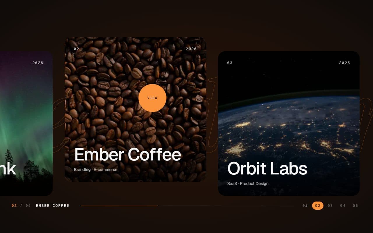
GSAP Horizontal Scroll Gallery with Lenis and Fullscreen Project View
On Scroll · Mouse Move · On Hover · On Click
No. 016 / Gallery
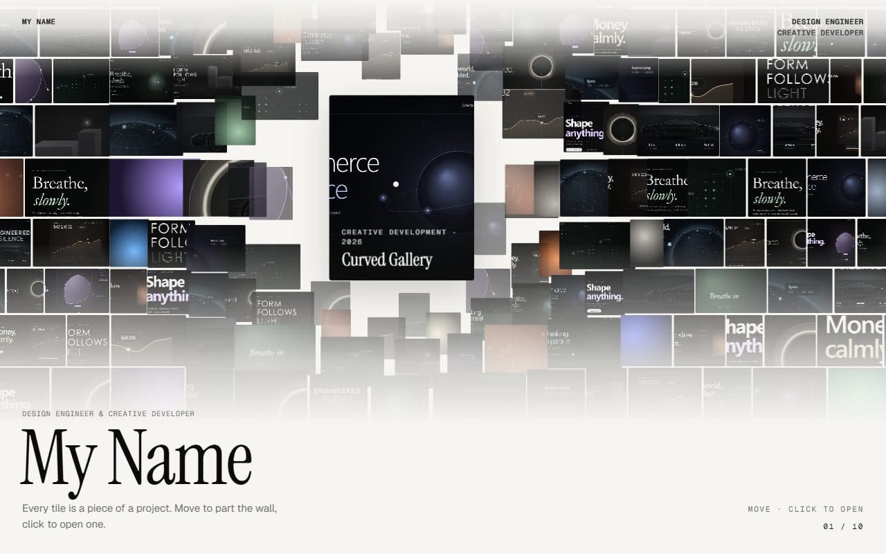
GSAP Parting Mosaic Wall Portfolio
On Scroll · Mouse Move · On Hover · On Click

No. 101 / Gallery
Hanging Mobile Gallery with Physics on Canvas
On Load · Drag · On Click
(02)FAQ
GSAP Expanding Image Panels Section with Rotating Titles — FAQ
01How do I add my panels?
Pass items with a title, image and alt text. A description, an href and a linkLabel are optional. Set defaultOpen to choose which one starts open.
02How do I change the height?
Pass panelsClassName with your own height classes. It replaces the default, so set both the phone and desktop heights.
03How many panels work best?
Four to seven. Closed panels share what the open one leaves, and titles need room to run up the side, so keep titles to a word or two.
04What does it need from my page?
npm install gsap @gsap/react, and Tailwind CSS v4. Images load through next/image, and the titles use your page's font.
05What happens with reduced motion?
Panels switch instantly and the entrance wipe is skipped. Hover, focus and tap still open them.