GSAP Fullscreen Menu with Circle Reveal
Overview
A fullscreen navigation menu for React and Next.js that opens as a circle growing out of the button you pressed. Big links rise from behind masks, and an image beside them wipes to match the link under the cursor.
The circle's centre is measured from the toggle each time it opens, and its radius is worked out to reach the far corner of the screen, so the reveal looks right wherever you place the button. Closing runs it back into the button, and pressing the toggle mid-way simply reverses from wherever it got to.
(01)Keep exploring
All 118 componentsBuilt with the same techniques
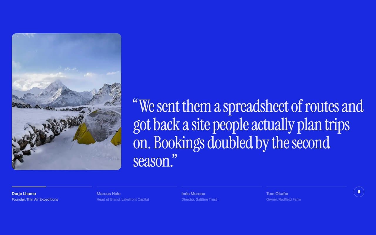
No. 088 / Testimonials
GSAP Testimonials Section with Auto-Advancing Quotes
On Load · On Click · On Hover · On Scroll
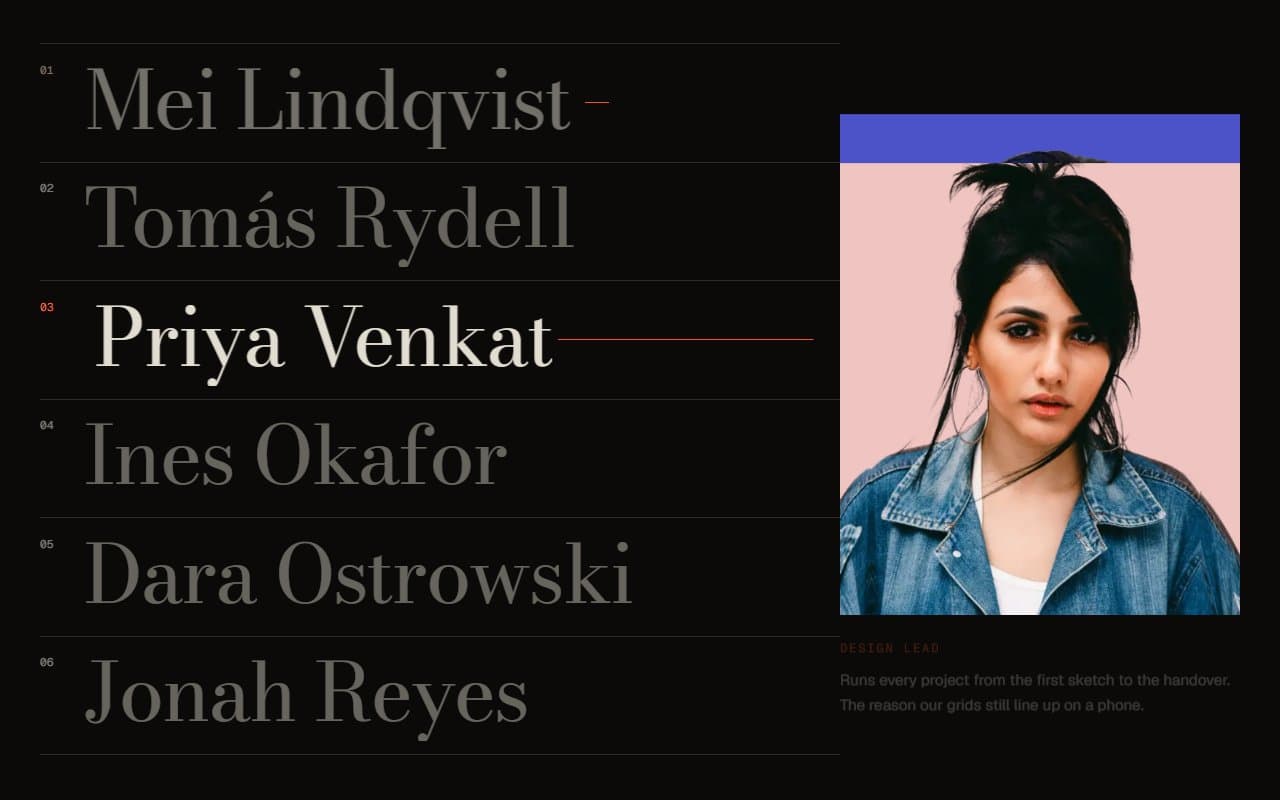
No. 087 / Team
GSAP Team Section with Names That Reveal Portraits
On Hover · On Click · On Scroll

No. 048 / CTA
GSAP Call to Action Section with Hover Colour Flood
On Hover · On Click · On Scroll
(02)FAQ
GSAP Fullscreen Menu with Circle Reveal — FAQ
01Do I need the images?
No. Leave image off every link and the links simply take the space. Images only show on large screens, so phones never download more than they use on screen.
02Where should I put it?
In your root layout, so it stays mounted across pages. The bar and panel are fixed, and sit at z-index 50 and 60.
03Does it work with Lenis?
The menu locks scrolling by setting overflow: hidden on the html element, which Lenis doesn't know about. Call lenis.stop() when it opens and lenis.start() when it closes.
04What if I have a lot of links?
The type scales with the height of the screen as well as the width, and the panel scrolls if it still doesn't fit.
05What happens with reduced motion?
The menu appears and disappears instantly, with no circle or rising links. Keyboard behaviour stays exactly the same.